
Final Logo
According to Stanford’s Identity Guide, their preferred fonts are Source Sans Pro and Roboto Condensed. I wound up going with the Roboto Condensed, as after I further experimented with it I found there to be a bluntness to it as a sans-serif font that meshed with the hosts jovial and funny nature.


Logo Prototypes
I experimented further with four different versions that I then submitted to the client. They chose the first of the four I submitted, which was great. It was the most successful of the four and the least complex.


Logo Sketches
Before worrying about Stanford’s preferred type and color palette, I focused purely on basic text and composition in my sketches. After several of these, I did a couple of thumbnail sketches with the square shape of the logo in mind. These were a chance to experiment with the order of the letters and what space they could be given to breathe. Once I began composing these in Illustrator the sketches informed the decisions I made.
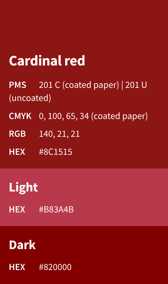
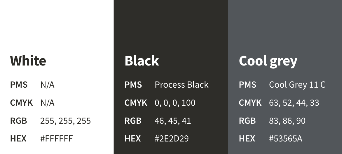
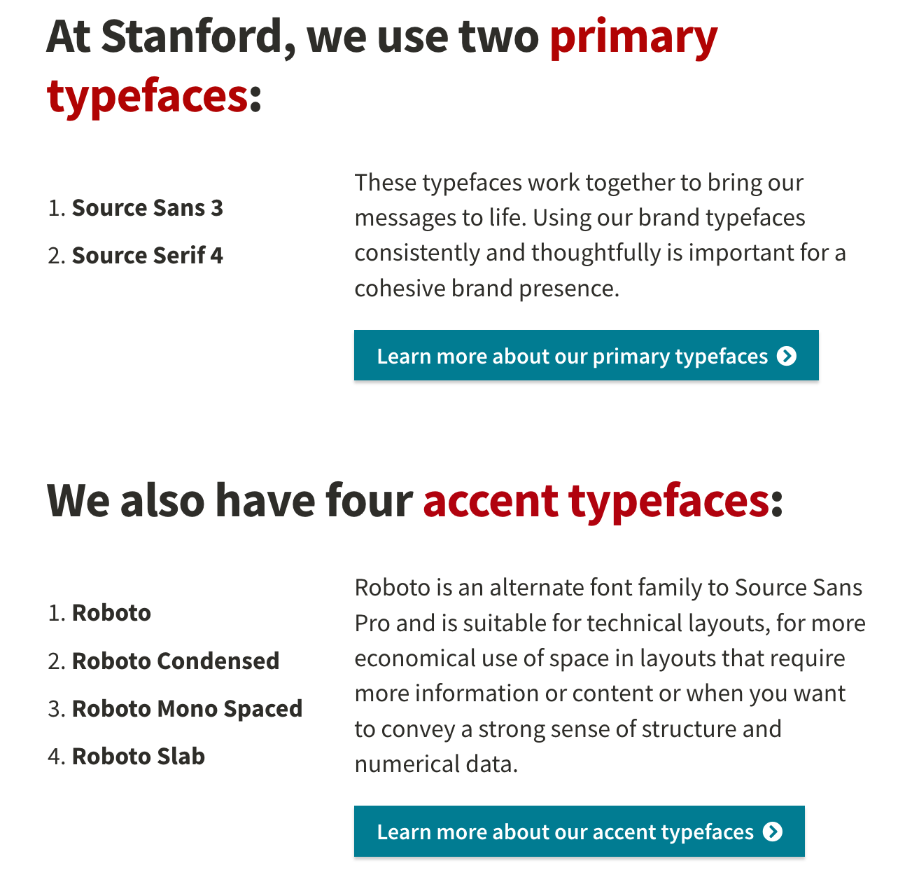
Examples of Stanford University's Identity Guide
These are examples of Stanford's Identity guide, which was adhered to in order to maintain brand consistency.
Linkedin Post
Merchandise Mockup
Type Info
Podcast Title Typeface: Roboto Condensed
Lower Text Typeface: Source Sans Pro
'Now Available' Size: 14px
Tracking: 0
Tools Used
Adobe Illustrator
Adobe InDesign
